3 Top-Performing Web Design Trends

I never thought that I would end up designing for the web. I learned the principles of graphic design in the
traditional way– for print. But with the rapid evolution of technology, design is constantly evolving stay
current. I was first introduced to web design back in 2010, and as the years have flown by, I have witnessed and
practiced a variety of web design trends that have shaped and honed my skills as a designer. These trends have
also dictated and shaped how users interact with technology. Today I will discuss three of the major trends I’ve
used time and time again.
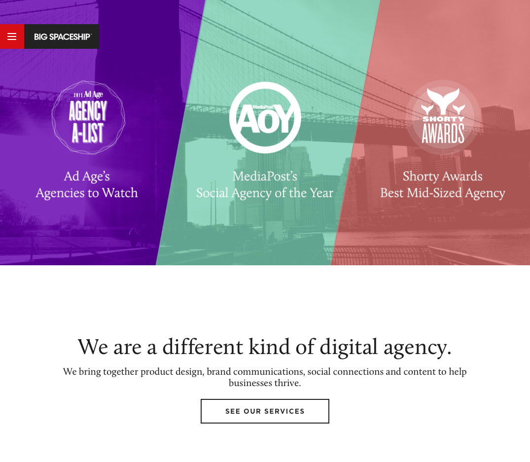
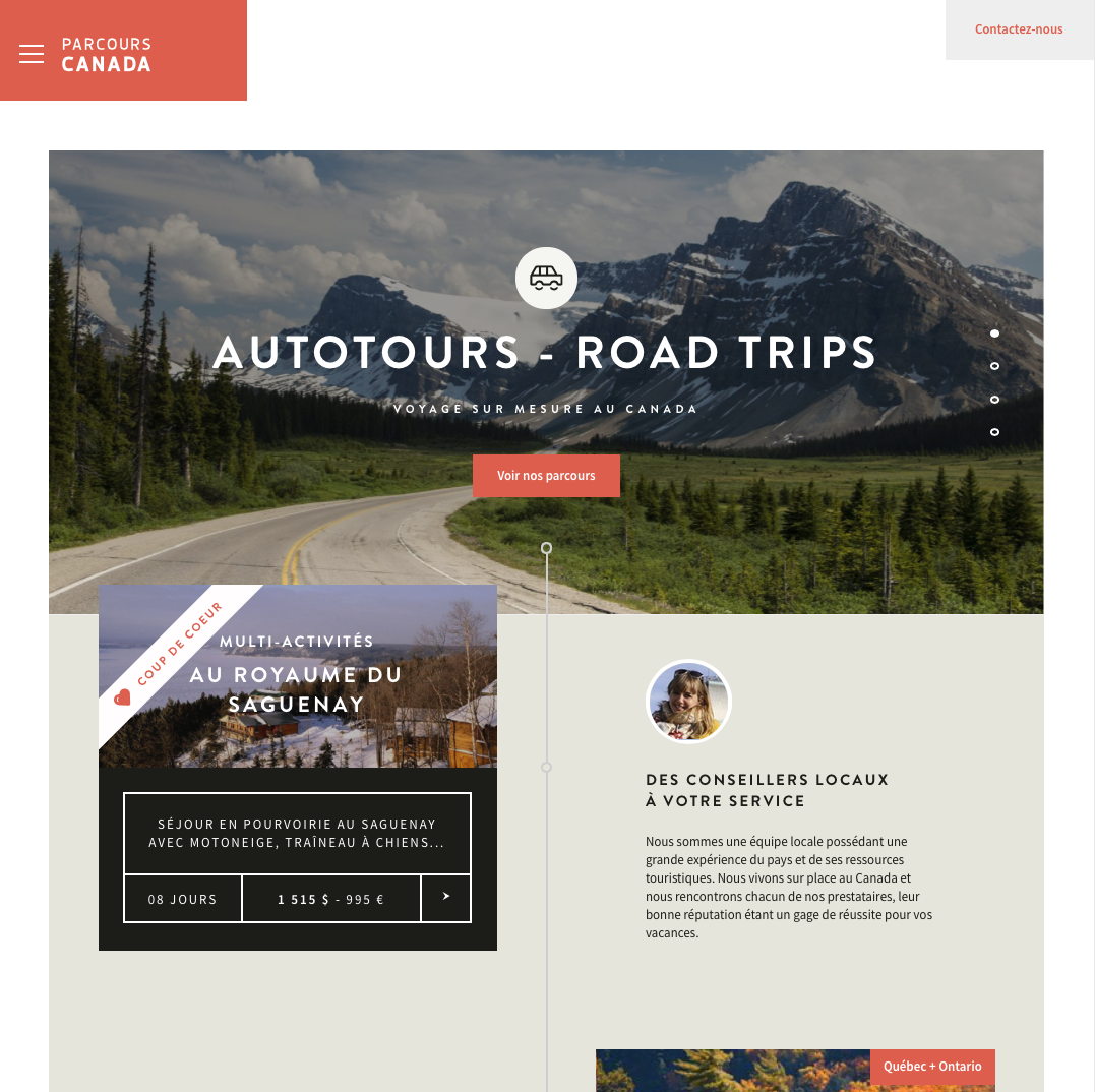
As delicious as a hamburger menu sounds, it is actually an icon made up of three short horizontal lines. This
icon style represents a list and is ideal for mobile devices due to the limited amount of real estate these
menus take. Recently, however, designers have replaced desktop/laptop top-of-screen navigation with a simple
hamburger menu.
Pros:
Cons: Could confuse and/or lose users since the main navigation is not present at a first glance.
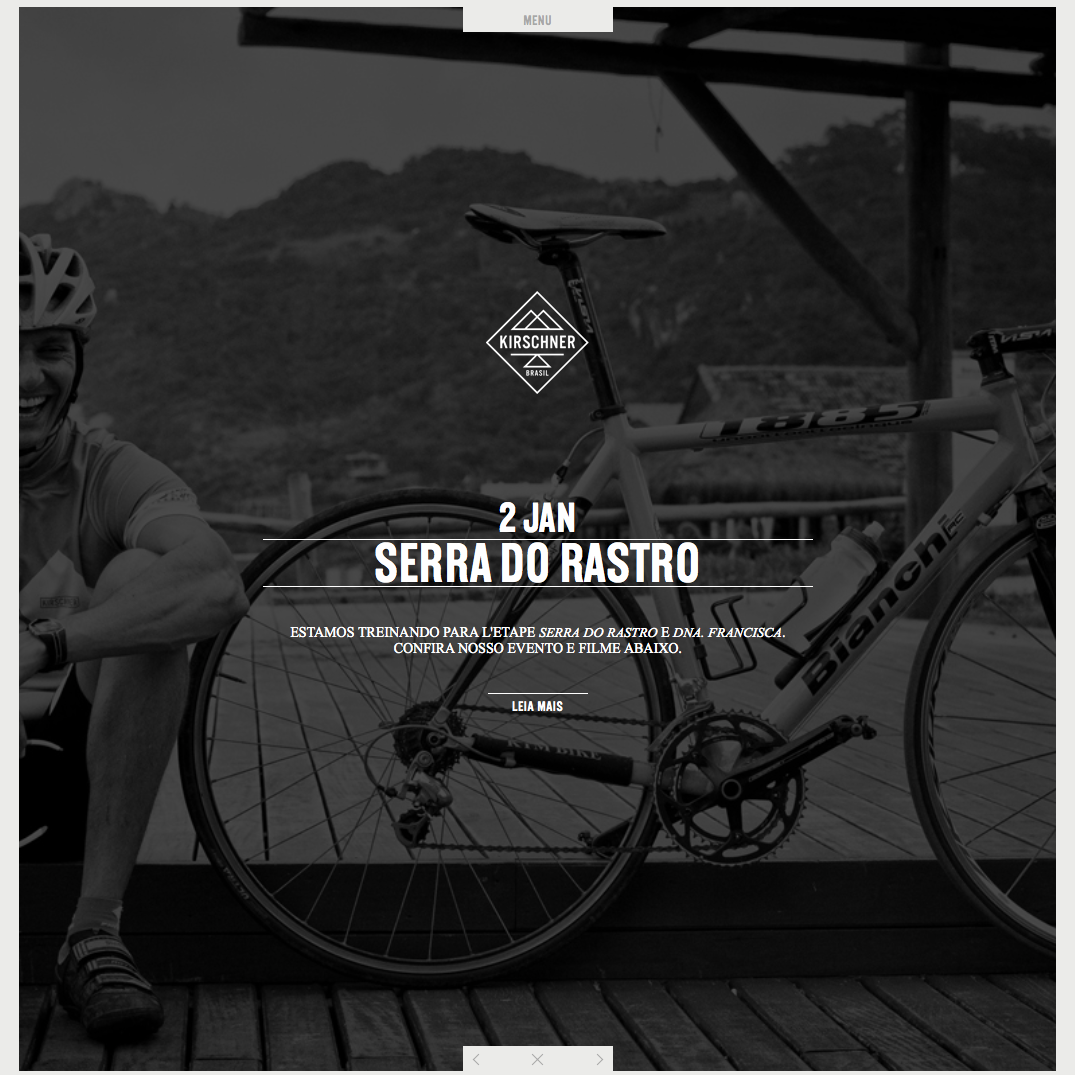
A hero image is a large banner image, generally placed front and center on a web page. A full-width image allows
for more visual impact by the supporting content within. For example, if a company sells tailored suits, they
can take advantage of the size of the image to showcase their product in finer detail. This full-width trend can
also include a looping video which entertains easily-distracted human brains. But these full-width images are
not always the center of attention; they can also work as a supporting backdrop.
Pros: Allows for a large space to showcase high quality visuals to keep
users engaged.
Cons: Everyone seems to be doing this and, therefore, a great number of websites have the same
general feel.
Flat design is graphics with no makeup. What do I mean by that? Buttons with no gradients, shiny, glittery stuff,
or images/shapes with no exaggerated drop shadows. The interesting thing about this trend is that you can still
give this design depth by doing flat drop shadows or using flat tints/shades. One can even say that this trend
is an emergence of print design through web design. This style gives a clean, sleek, modern and minimalist
design for today’s modern web.
Pros: Can be easily supported across multiple browsers since there is no fancy added
styles/treatments to graphic elements.
Cons: Flat design can look dull since it doesn’t have added cosmetics to make people want to click
or look at targeted elements.